
Welcome to Daisyland
Case Study 3 – The Travel App
The Wanderer Travel App
- Project Duration: May 2020
- My Role: Product Designer
- Tools: Figma, Sketch, Adobe XD, Photoshop, Illustrator, Flutter
- Responsibilities:
- Establish Visual Identity: Define and implement the “Horizon Ethos” design system, ensuring a premium, editorial feel that prioritizes high-quality imagery and sophisticated typography
- Optimize User Flows: Design intuitive navigation and input systems, such as the flexible date-picking logic and the predictive city/country search, to reduce friction during the initial planning phase
- Architect Information Hierarchy: Structure the “Home,” “My Trip,” “Map,” and “Profile” views to ensure that critical travel information is accessible while maintaining a clean, uncluttered aesthetic
- Drive Interactive Engagement: Create interactive prototypes that demonstrate how the application responds to user input, ensuring the experience feels fluid and responsive across mobile devices
- Curate Exploration: Design discovery modules that utilize data points (weather, popularity) to provide users with meaningful destination ideas, moving beyond simple lists to an “ideation gallery”
- The Problem: Modern travelers often feel overwhelmed by the fragmented nature of trip planning. Existing tools frequently force users into rigid structures, requiring exact dates or specific locations before offering inspiration. There is a lack of a cohesive, “editorial-first” experience that balances the functional need for logistics (searching for cities, picking dates) with the emotional desire for discovery and curated exploration
- The Goal: The primary objective is to design a responsive, high-fidelity travel application that simplifies the transition from “dreaming” to “doing.” The goal is to provide a seamless, intuitive interface where users can easily input travel parameters; whether they have specific dates or just a duration in mind while being inspired by contextually relevant recommendations based on weather, activities, and current trends

User Research – Personas / Pain Points

Time / Dislike
The busy daily schedule and don’t have a sit down time to concentrate on making a travel plan after a long day of work and found planning frustrated.

Want More
Ran out of idea on where to go and wish a platform can recommend ideas according to what they like.
User Journey Maps


Storyboard


Wireframe – Paper to Digital


Affinity Diagram


Usability Study – Findings
Round 1 Findings
- Users want to see more function after adding all sightseeing spots
- User not sure what to do after adding all sightseeing spots
Round 2 Findings
- User found save button icon and location aren’t obvious enough
- User now want to have restaurant reservation function
Refining Design to Mockups & High-Fidelity Prototype


Accessibility Considerations
Color
I wanted to use one color tone to keep the app with cleaner looking but turns up the contrast for the CTA buttons and background isn’t enough for users to notice where the CTA button locate.
Icon
Some users doesn’t recognized the save button icon I used due to floppy disk isn’t popular nowadays.
Font & Spacing
Provide more space around text and make sure user doesn’t mis-clicked something else.
Design System

SiteMap & Responsive Website


Takeaways & Going Forward
What I Learned
Users in general like a straightforward interface instead of too much browsing around. In another word, too many choices makes is harder to decide.
What I Can Do Better
I can do more infographic research and creation on what icon to use to avoid the same mistake I made for the save CTA button as some participants doesn’t recognize the icon but still click on it as it looks like the next action to take.
Going forward
I would like to implement more functions such as ticket booking, hotel reservation just as what some of the participants suggested to have a more completed all-in-one application.
Other Case Studies
FinTech

Interface that streamlines complex transactions into an intuitive, institutional-grade command center.
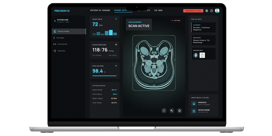
MedTech
An intuitive travel application where users input travel parameters while being inspired by contextually relevant recommendations.