Case Study 3 - The Travel App
The Wanderer Travel App
- Project Duration: May 2020
- My Role: Product Designer
- Tools: Figma, Sketch, Adobe XD, Photoshop, Illustrator, Flutter
- Responsibilities:
- Establish Visual Identity: Define and implement the "Horizon Ethos" design system, ensuring a premium, editorial feel that prioritizes high-quality imagery and sophisticated typography
- Optimize User Flows: Design intuitive navigation and input systems, such as the flexible date-picking logic and the predictive city/country search, to reduce friction during the initial planning phase
- Architect Information Hierarchy: Structure the "Home," "My Trip," "Map," and "Profile" views to ensure that critical travel information is accessible while maintaining a clean, uncluttered aesthetic
- Drive Interactive Engagement: Create interactive prototypes that demonstrate how the application responds to user input, ensuring the experience feels fluid and responsive across mobile devices
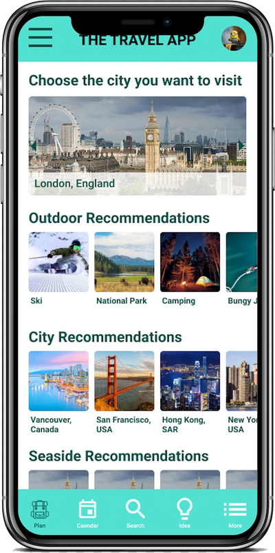
- Curate Exploration: Design discovery modules that utilize data points (weather, popularity) to provide users with meaningful destination ideas, moving beyond simple lists to an "ideation gallery"
- The Problem: Modern travelers often feel overwhelmed by the fragmented nature of trip planning. Existing tools frequently force users into rigid structures, requiring exact dates or specific locations before offering inspiration. There is a lack of a cohesive, "editorial-first" experience that balances the functional need for logistics (searching for cities, picking dates) with the emotional desire for discovery and curated exploration
- The Goal: The primary objective is to design a responsive, high-fidelity travel application that simplifies the transition from "dreaming" to "doing." The goal is to provide a seamless, intuitive interface where users can easily input travel parameters; whether they have specific dates or just a duration in mind while being inspired by contextually relevant recommendations based on weather, activities, and current trends
User Research - Personas / Pain Points

Time / Dislike
The busy daily schedule and don't have a sit down time to concentrate on making a travel plan after a long day of work and found planning frustrated.
Want More
Ran out of idea on where to go and wish a platform can recommend ideas according to what they like.
User Journey Maps


Close Up Storyboard
Storyboard

Big Picture Storyboard

Close Up Storyboard
Wireframe - Paper to Digital

Paper Wireframe

To Wireframe
Low-Fidelity Prototype

Low-Fidelity Prototype Close Up
Affinity Diagram

Affinity Diagram
Affinity Diagram Arranged
Refining Design to Mockups & High-Fidelity Prototype

Before & After Usability Study
Before & After Usability Study
Mockup
High-Fidelity Prototype
High-Fidelity Prototype Close Up
Design System

SiteMap & Responsive Website

Travel App Website Sitemap

Responsive Website