Case Study 1 - The Travel App
A travel app made for people who doesn’t do journey planning but yet wanting to go everywhere
- Project Duration: May 2020 - Present
- My Role: UX & UI Designer
- Tools: Figma, Sketch, Adobe XD, Photoshop, Illustrator, Flutter
- Responsibilities: All UX approaches including personas, discover user pain points, user journey maps, ideations, storyboards, wireframe, UI design, prototype, user testing, usability study, accessibility consideration and affinity diagram
- The Problem: Most people love traveling but not everyone like doing travel planning or they have busy schedule
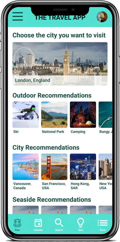
- The Goal: Create a app that allows people to plan journey with just few clicks and giving recommendations to users according to their sign up preferences
User Research - Personas / Pain Points

Time / Dislike
The busy daily schedule and don't have a sit down time to concentrate on making a travel plan after a long day of work and found planning frustrated.
Want More
Ran out of idea on where to go and wish a platform can recommend ideas according to what they like.
User Journey Maps


Close Up Storyboard
Storyboard

Big Picture Storyboard

Close Up Storyboard
Paper wireframe to Wireframe

Paper Wireframe

To Wireframe
Low-Fidelity Prototype

Low-Fidelity Prototype Close Up
Affinity Diagram

Affinity Diagram
Affinity Diagram Arranged
Refining the design to Mockups & High-Fidelity Prototype

Before & After Usability Study
Before & After Usability Study
Mockup
High-Fidelity Prototype
High-Fidelity Prototype Close Up
Design System

SiteMap & Responsive website

Travel App Website Sitemap

Responsive Website